Enemy Concept Design, Walk Cycle, Death Animation, In Game Implementation
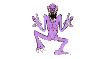


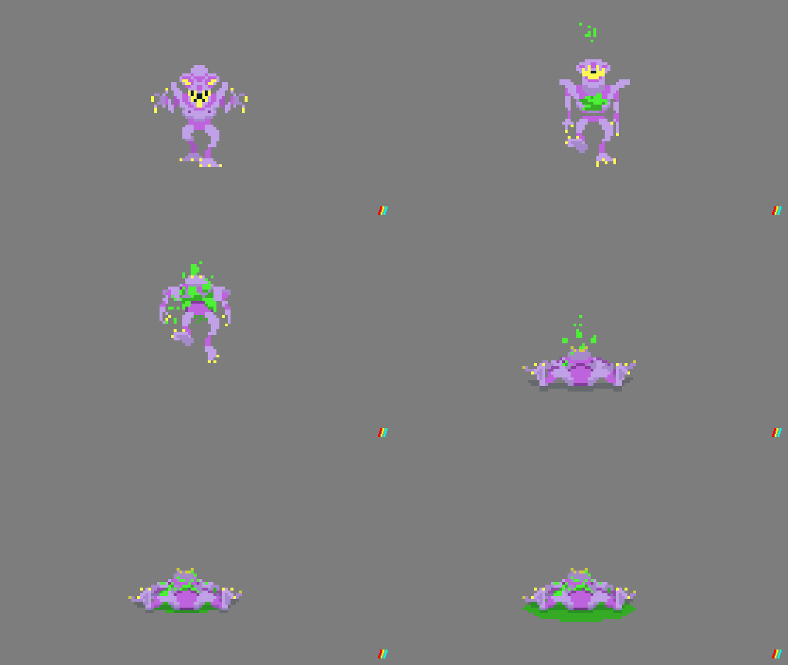

This blog documents the design process of an enemy character from Concept art, to animation, and finally the in game sprite.
CONCEPT ART - BLARGAZORG
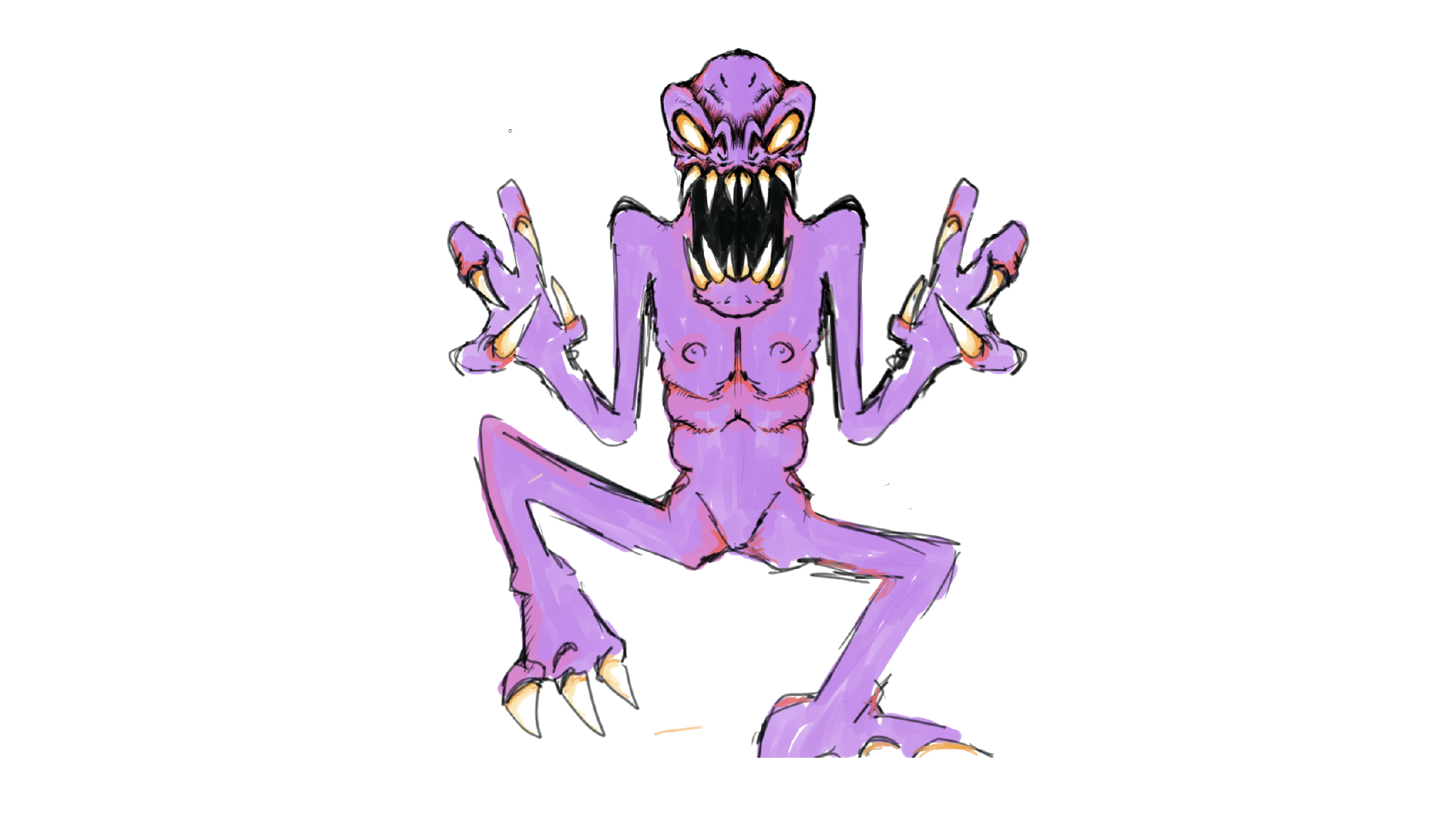
Blargazorg's design is inspired by movie classics like Alien and Predator, as well as 90's era video games like Doom. Once we all approved the characters concept art, I made a pixel art sprite of the character in photoshop. In this process some of Blargazorg's details were modified to fit the smaller pixel scale. He had lost one of his fingers to give him a total of 3 digits. Details like his defined rib cage and six-pack were also smoothed out. However, he did get a cool 70's scifi outfit with speedos and gauntlets. His alien space nipples were also left intact.
From here the programer could put him into Unity to see if the design, color, and sizing worked with the project and gameplay.
ANIMATION - Walk cycle
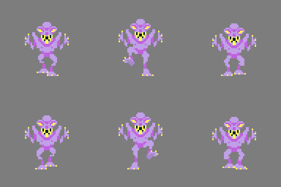
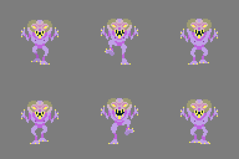
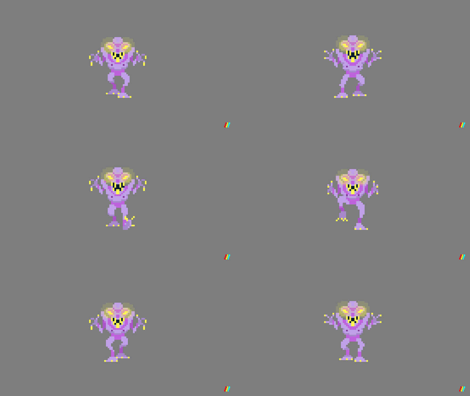
For Blargazorg's walk cycle started by first animating his feet and his entire bodies up and down motion. Once I had that looking pretty good, I started to animate the upper half of his torso, as well as giving his eye's a yellow glow. The glow would help him standout from the games backgrounds.
ANIMATION - Death
For the death animation I looked closely at the original doom sprites. My goal was to take those and push the envelope one step farther in terms of animation smoothness and violence. I started the animation by having Blarg's entire upper have become dismembered from his body...
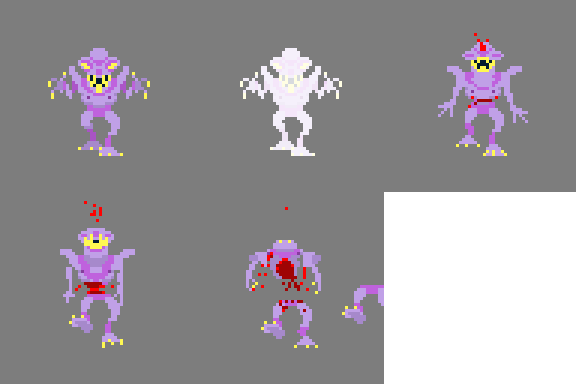
But after spending a little too much time with it, and the clock winding down to the end of the Jam, I decided to scale the animation back. I concentrated on the in-game readability of the corpse falling to the ground, and blood splatter...

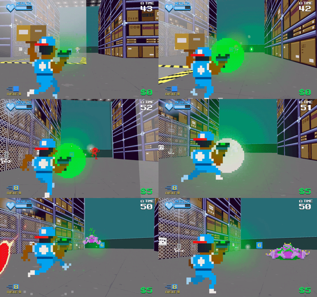
Overall I think the animations look great, but some don't shine through as much as I thought they would in actual game play. The game is super fast paced, so you don't noticed the finer details of the walk cycle. Bigger animations like the death animations and explosions really shine through. The lesson learned is that I think when I do this again for the next game/character I will start with stronger key frames to see how they look in game before adding the in-between frames.
Blog by Meeka Elliott
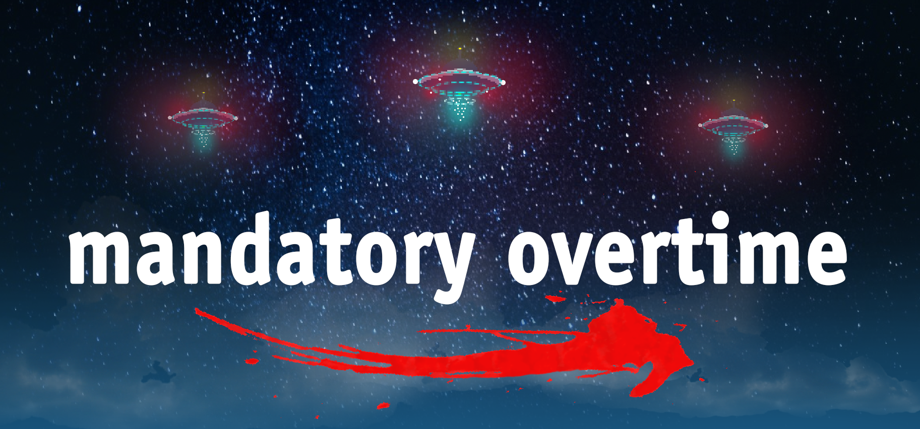
Mandatory Overtime
Aliens have invaded earth, but warehouse management doesn’t care, work must go on!!!
| Status | Prototype |
| Authors | Tooth Games, Meeka Arcade |
| Genre | Shooter, Action |
| Tags | 3D, Arcade, bayou, Doom, Fast-Paced, megaman, Pixel Art, Retro |
Leave a comment
Log in with itch.io to leave a comment.